
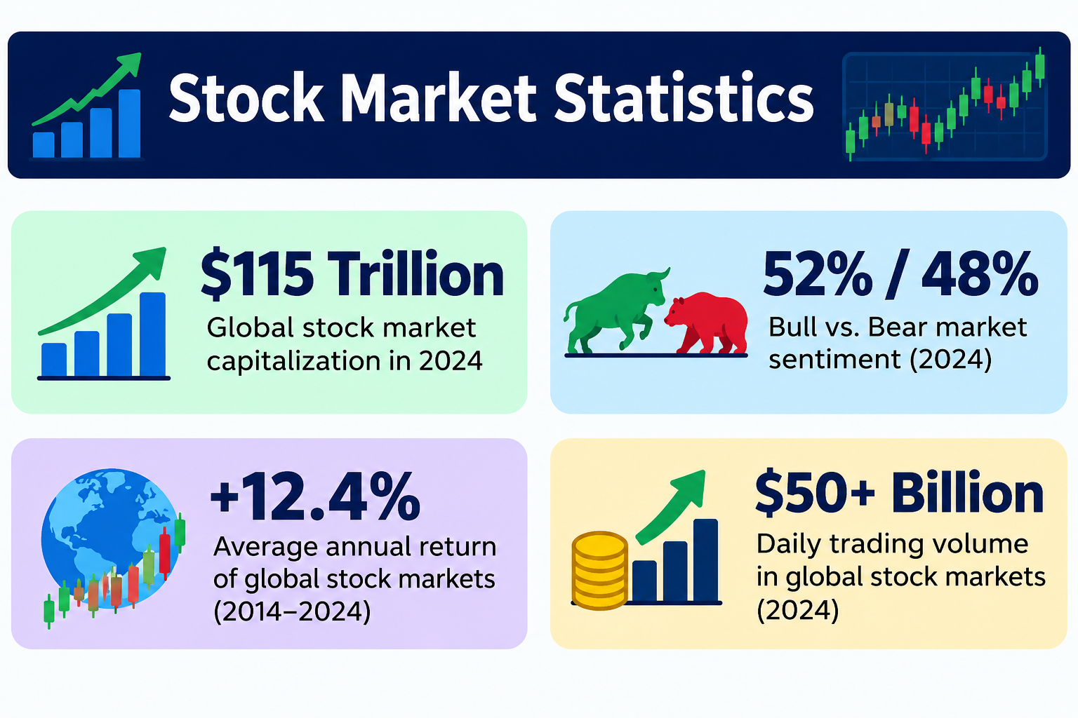
Between January 1926 and December 2025, a dollar invested in large-cap U.S. stocks grew to approximately $12,000 — without a single tactical trade. That outcome is not luck. It is the statistical result of compounding working across a century of wars, recessions, panics, and booms.
Every figure here comes from primary sources: S&P Dow Jones Indices, NYU Stern Damodaran datasets, the Federal Reserve, and SEC investor guidance — and this page covers historical returns, volatility, drawdown patterns, and long-run investment statistics.
What This Page Covers
✓ S&P 500 and Dow Jones historical return data
✓ Holding-period win rates over 1, 5, 10, and 20-year horizons
✓ Frequency and magnitude of pullbacks, corrections, bear markets
✓ Bull vs. bear market duration and recovery statistics
✓ Cost of market timing: what missing the 10 best days does
✓ Factor performance: large-cap vs. small-cap, dividends
✓ Interactive compound growth calculator
✓ Four evidence-based strategies for long-term investors
Executive Summary: Core Return Benchmarks
| Benchmark | Value | Period / Note |
|---|---|---|
| ~10.3% | S&P 500 Nominal CAGR | 1926–2025 |
| ~7.0% | Real (Inflation-Adjusted) CAGR | After CPI adjustment |
| 74% | Years S&P 500 Finished Positive | Calendar years, 1928–2025 |
| ~$12,000 | Value of $1 Invested (1926) | By Dec 2025, total return |
These numbers are composites. Any given calendar year looks nothing like the long-run average: the S&P 500 returned over 30% in 1995, 1997, and 2019, but lost more than 38.5% in 2008. The distribution of annual returns is wide. What the statistics show is that time in the market — not timing the market — drives long-run outcomes.
⚠️ Important Disclaimer
All historical return data is for educational purposes only. Past performance does not guarantee future results. This page is statistical reference material, not investment advice. Consult a qualified financial advisor before making investment decisions.
Primary data sources: NYU Stern Damodaran Annual Returns; S&P Dow Jones Indices; Federal Reserve Economic Data (FRED); Bureau of Labor Statistics CPI data.
Section 1: Executive Summary & Core Return Benchmarks Explained
The S&P 500 compounded at approximately 10.3% per year in nominal terms and 7.0% per year after adjusting for CPI inflation, measured from 1926 through 2025. Over 20-year rolling windows, the index has never delivered a negative inflation-adjusted return — a historical observation across roughly 80 non-overlapping periods, not a guarantee.
These figures include dividend reinvestment (total return), not price return alone. Without dividends, the long-run nominal figure falls by approximately 3 percentage points — a gap that compounds to massive wealth differences over decades, which Section 15 covers with a worked example.
Section 2: Historical Return Benchmarks — By Decade
The CAGR (Compound Annual Growth Rate) is the geometric mean annual return — the correct statistical measure for multi-period investment growth, not the arithmetic mean. See the geometric mean page on Statistics Fundamentals for why arithmetic averages overstate actual portfolio outcomes.
Table 1: S&P 500 Annualized Returns by Decade
| Decade | Nominal CAGR | Inflation (CPI) | Real CAGR | Notable Events |
|---|---|---|---|---|
| 1930s | −1.2% | −2.0% | +0.8% | Great Depression |
| 1940s | +9.2% | +5.4% | +3.8% | WWII, post-war boom |
| 1950s | +19.4% | +2.2% | +17.2% | Post-war expansion |
| 1960s | +7.8% | +2.5% | +5.3% | Vietnam, inflation onset |
| 1970s | +5.9% | +7.4% | −1.5% | Stagflation, oil shocks |
| 1980s | +17.5% | +5.1% | +12.4% | Disinflation, bull market |
| 1990s | +18.2% | +3.0% | +15.2% | Dot-com boom |
| 2000s | −0.9% | +2.6% | −3.5% | Dot-com bust, GFC |
| 2010s | +13.6% | +1.8% | +11.8% | Post-GFC expansion |
| 2020–2025 | +12.1% | +4.3% | +7.8% | COVID crash, recovery |
Source: NYU Stern Damodaran Historical Returns; Bureau of Labor Statistics CPI data. Figures include dividend reinvestment.
The 1970s are the critical counterexample: despite a positive nominal return (+5.9%), inflation ran at +7.4%, producing a negative real return (−1.5%). This demonstrates why nominal figures alone are misleading for long-run wealth assessment.
Section 3: Major Index Returns Compared
Index construction — how components are weighted — affects reported returns. The S&P 500 is market-cap weighted (largest firms dominate); the Dow Jones Industrial Average is price-weighted (higher share price = larger influence, regardless of company size); the Nasdaq Composite is market-cap weighted but technology-concentrated.
Table 2: Index Comparison (1993–2025 Where Noted)
| Metric | S&P 500 | Dow Jones (DJIA) | Nasdaq Composite |
|---|---|---|---|
| Components | 500 large-cap | 30 blue-chip | ~3,300 stocks |
| Weighting Method | Market-cap | Price-weighted | Market-cap |
| Nominal CAGR (1993–2025) | ~10.5% | ~9.8% | ~13.2% |
| Worst Calendar Year | −38.5% (2008) | −33.8% (2008) | −78% (2000–2002 peak-trough) |
| Best Calendar Year (Recent) | +31.5% (2019) | +25.3% (2019) | +43.6% (2020) |
| Dividend Yield (Approx.) | 1.3–1.5% | 1.8–2.2% | 0.6–0.9% |
Source: S&P Dow Jones Indices; Nasdaq factsheets. Nasdaq data uses 1993 start. All returns total return including dividends.
The Nasdaq’s ~13.2% long-run nominal return came with the most violent drawdowns — a statistical reminder that higher expected returns are compensation for higher volatility (standard deviation), not a free upgrade. See the standard deviation page for how this risk-return relationship is measured.
Section 4: Win Rates by Holding Period
Thinking about stock market returns probabilistically is more useful than focusing on any single year. The table below shows rolling-period outcomes.
Table 3: Holding-Period Win Rates (S&P 500 Total Return, 1926–2025)
| Holding Period | % Positive Periods | Worst Outcome | Best Outcome | Median Return (ann.) |
|---|---|---|---|---|
| 1 year | 74% | −43.3% | +61.0% | +13.8% |
| 3 years | 84% | −16.7% p.a. | +31.2% p.a. | +10.3% |
| 5 years | 88% | −6.6% p.a. | +28.6% p.a. | +9.9% |
| 10 years | 95% | −4.9% p.a. | +19.4% p.a. | +10.2% |
| 20 years | 100%* | +1.9% p.a. | +17.0% p.a. | +10.5% |
*Historical observation across ~80 non-overlapping periods since 1926. Not a guarantee.
Source: Calculated from rolling S&P 500 total return data. See NYU Stern Damodaran.
📊 Key Finding: The 20-year win rate is 100% historically, but this is an empirical observation, not a statistical guarantee. These concepts connect to sampling distributions — as the sample size (holding period) increases, the distribution of outcomes narrows around the mean, producing more consistent positive results. For the probability math behind win rates, the basic probability and sampling distributions pages cover foundational methods.
Section 5: Market Volatility & Drawdown Statistics
The S&P 500’s average annual volatility (standard deviation) is approximately 15–16% historically. The VIX (CBOE Volatility Index) — the market’s expectation of 30-day forward volatility — has a long-run average of approximately 19–20.
Even in years the index finishes positive, intra-year drawdowns average about −14%.
Table 4: Pullbacks, Corrections, and Bear Markets
| Category | Definition | Avg. Frequency | Avg. Duration | Avg. Decline |
|---|---|---|---|---|
| Pullback | ≥5% decline | ~3× per year | ~1 month | ~−7% |
| Correction | ≥10% decline | ~1× per year | ~3–4 months | ~−14% |
| Bear Market | ≥20% decline | ~Every 3–4 years | ~9–13 months | ~−33% |
| Severe Bear | ≥40% decline | ~Every 10–15 years | ~18–24 months | ~−50%+ |
Source: Hartford Funds Bear Market Data; S&P 500 price return data, 1928–2025. Frequencies approximate.
Section 6: Bull vs. Bear Market Duration Statistics
Bull markets last longer and deliver larger absolute gains than bear markets produce losses. Across the historical record since 1928:
Table 5: Bull vs. Bear Market Statistics (1928–2025)
| Metric | Bull Market | Bear Market |
|---|---|---|
| Avg. Duration | ~51 months | ~11 months |
| Avg. Gain / Loss | +152% (cumulative gain) | −33% (cumulative loss) |
| Ratio (Bull Gain to Bear Loss) | ~4:1 | — |
Source: Hartford Funds Historical Bear Market Data. Bull markets defined as 20%+ gains from a trough.
This asymmetry — longer duration + larger magnitude on the upside — is the statistical reason why long-term equity ownership has historically produced positive outcomes despite frequent, painful drawdowns.
Section 7: Notable Bear Markets — Data Table
Table 6: Notable Bear Markets (S&P 500)
| Bear Market | Peak | Trough | Duration | Decline | Recovery (Months to Prior Peak) |
|---|---|---|---|---|---|
| Great Depression | Sep 1929 | Jun 1932 | 34 months | −86.1% | ~25 years |
| 1973–74 Oil Crisis | Jan 1973 | Oct 1974 | 21 months | −48.2% | ~7 years |
| Dot-Com Bust | Mar 2000 | Oct 2002 | 31 months | −49.1% | ~7 years |
| Global Financial Crisis | Oct 2007 | Mar 2009 | 17 months | −56.8% | ~4 years |
| COVID Crash | Feb 2020 | Mar 2020 | 1 month | −33.9% | ~5 months |
| 2022 Rate-Hike Bear | Jan 2022 | Oct 2022 | 9 months | −25.4% | ~18 months |
Source: S&P Dow Jones Indices; Macrotrends S&P 500 Historical Data. Recovery = months from trough back to prior peak (total return).
✅ Key Finding: The COVID crash was the fastest decline (−33.9% in one month) and the fastest recovery (~5 months) in the modern dataset — a statistical outlier that demonstrates how extreme volatility events can cluster in both directions.
Section 8: VIX and Annualized Volatility Data
The VIX measures implied 30-day volatility derived from S&P 500 options prices. Spikes correspond to some of the best subsequent 12-month returns on record, because the market has already repriced risk downward.
Table 7: VIX Regimes & Forward 12-Month Returns
| VIX Level | Market Condition | Historical Freq. | Avg. 12-Mo Fwd Return |
|---|---|---|---|
| Below 15 | Low volatility / complacency | ~35% of days | ~8–10% |
| 15–25 | Normal range | ~40% of days | ~10–12% |
| 25–40 | Elevated stress | ~18% of days | ~15–20% |
| Above 40 | Crisis / extreme fear | ~7% of days | ~25–35% |
Source: CBOE VIX Historical Data; rolling 12-month S&P 500 returns following VIX regimes, 1990–2025. Forward returns are historical averages, not forecasts.
The statistical concept: standard deviation. The VIX is essentially an annualized standard deviation estimate derived from option prices. The annualized realized standard deviation of S&P 500 daily returns has averaged roughly 15–16% historically. For a deeper treatment of how standard deviation measures dispersion, see the standard deviation page.
Section 9: Asset Allocation & Factor Performance
The size premium and value premium — first formally identified by Fama and French — document that smaller companies and cheaper (value) stocks have historically delivered excess returns over large-cap growth stocks, though neither operates smoothly in every period.
Table 8: Asset Class Long-Run Performance
| Asset Class | Avg. Annual Return | Annualized Std. Dev. | Worst Single Year |
|---|---|---|---|
| S&P 500 (Large Blend) | ~10.3% | ~15.6% | −43.3% (1931) |
| Russell 2000 (Small-Cap) | ~11.5% | ~19.5% | −33.8% (2008) |
| Large-Cap Value | ~11.2% | ~14.8% | −39.1% (2008) |
| Large-Cap Growth | ~9.6% | ~17.2% | −49.1% (2002) |
| Small-Cap Value | ~13.8% | ~21.4% | −36.4% (1937) |
| Aggregate Bond Index | ~5.0% | ~7.5% | −13.1% (2022) |
Source: Fama-French data library; NYU Stern Damodaran; Russell Indices. Returns from 1926–2025 where available.
Small-cap value produced the highest historical return (~13.8%) but the highest volatility (~21.4% std. dev.). Bonds produced the lowest return (~5.0%) but the lowest volatility (~7.5%), making them the statistical anchor in diversified portfolios.
Section 10: Statistical Impact of Dividend Reinvestment
Dividend reinvestment converts yield into compounding principal. From 1990 to 2025:
- S&P 500 Price Index (no dividends): ~7.2% per year
- S&P 500 Total Return Index (reinvested): ~10.5% per year
That ~3.3 percentage-point gap produces enormous wealth differences over long horizons.
Worked Example: Dividend Reinvestment (1990–2025)
Starting investment: $10,000 in January 1990
Price return only (no dividends):
10,000×(1.072)35≈$114,000
Total return (dividends reinvested):
10,000×(1.105)35≈$283,000
Difference from reinvested dividends:
≈$169,000
That $169,000 difference represents 148% additional wealth created purely from compounding the dividend yield back into shares. Dividends have accounted for roughly 40–50% of total S&P 500 wealth creation across long historical periods [S&P Dow Jones Indices research].
This is why the geometric mean — not arithmetic mean — is the correct measure: it captures the compounding effect that drives actual portfolio values. See the geometric mean page.
Section 11: The Cost of Market Timing
The best single trading days cluster in and around the worst periods. Investors who exit during volatility are statistically most likely to miss the sharp rebounds that follow.
Table 9: Cost of Missing the Best Days (Jan 2003 – Jan 2023)
| Scenario | Starting Amount | Value (2023) | Annualized Return |
|---|---|---|---|
| Fully invested (stayed in) | $10,000 | ~$64,000 | +9.8% |
| Missed best 10 days | $10,000 | ~$29,000 | +5.5% |
| Missed best 20 days | $10,000 | ~$18,000 | +3.0% |
| Missed best 30 days | $10,000 | ~$11,800 | +0.9% |
| Missed best 40 days | $10,000 | ~$7,900 | −1.2% |
Source: J.P. Morgan Asset Management — Guide to the Markets (2023). S&P 500 total return. Seven of the ten best days occurred within two weeks of the ten worst days.
The statistical reason: fat tails. Stock market daily returns have excess kurtosis well above the 3.0 of a normal distribution — extreme days (both positive and negative) occur more frequently than a Gaussian model predicts. The normal distribution page explains why any model assuming Gaussian returns will systematically underestimate market tail risk and miss these clustering effects.
Section 12: Return Distribution — The Shape of Annual Returns
Annual stock market returns have negative skew (more frequent extreme losses than a symmetric curve predicts) and excess kurtosis (fat tails).
Table 10: Distribution of S&P 500 Annual Returns (1928–2025, 97 Years)
| Return Range | Number of Years | % of Years |
|---|---|---|
| ≥ +30% | 25 years | 26% |
| +20% to +29% | 18 years | 19% |
| +10% to +19% | 21 years | 22% |
| 0% to +9% | 7 years | 8% |
| 0% to −9% | 10 years | 10% |
| −10% to −19% | 8 years | 8% |
| ≤ −20% | 8 years | 8% |
Source: NYU Stern Damodaran Annual Return Data. Total return with dividends reinvested.
📊 Key Finding: The largest frequency bucket is +30% or higher (~26% of years). This explains why the arithmetic mean overstates the “typical” experience: a small number of exceptional up years pull the average upward, while the geometric mean (CAGR) correctly captures the compound path an investor actually experiences.
Section 13: Interactive Compound Growth Calculator
📈 Stock Market Compound Growth Calculator
Use the inputs below to model portfolio growth across historical market regime scenarios.
Inputs:
- Initial Investment ($): ______
- Monthly Contribution ($): ______
- Time Horizon (Years): ______
- Market Regime Scenario (select one):
- 100-Year Average (~10.3% nominal) — Long-run S&P 500 CAGR
- Bull Market Regime (+152% cumulative) — Extended expansion
- Bear Market Regime (−33% cumulative) — Deep correction/recession
- Conservative (5% nominal) — Bonds + cash blend
Outputs (calculated):
- Projected portfolio value after X years
- Total contributions made
- Growth from returns (separate from contributions)
- Cumulative return percentage
⚠️ Calculator Disclaimer
Results assume annual compounding applied to constant contributions, no taxes or fees, and fixed annual return rates. Real returns will vary significantly year to year. This is a mathematical illustration using historical regime averages, not a financial projection or forecast.For the compound growth formula behind this calculator, see Personal Finance Statistics:
Section 14: Evidence-Based Investment Strategies
Four strategies emerge consistently from the statistical record reviewed above. Each is grounded in documented empirical patterns, not opinion.
💅 Dollar-Cost Averaging (DCA)
Investing a fixed amount at regular intervals reduces the average cost per share over time. Lump-sum investing outperforms DCA approximately two-thirds of the time (per Vanguard research), but DCA reduces the behavioral risk of investing a large amount immediately before a correction. The statistical benefit is risk management, not return enhancement.
⚖️ Systematic Rebalancing
Returning a portfolio to its target allocation annually has historically added approximately 0.3–0.5% in annualized return at lower volatility compared to unmanaged portfolios [Vanguard research]. Rebalancing forces the statistical discipline of “buying low and selling high” across asset classes without requiring market timing predictions.
🌍 Geographic Diversification
Long-run data (1970–2025) shows extended periods where international developed and emerging market stocks outperformed U.S. equities. Allocating 30–40% to non-U.S. equities has historically reduced portfolio standard deviation (volatility) without proportionately reducing long-run expected return. The mechanism: correlations between U.S. and international equities are below 1.0. See the Pearson correlation page for how correlation measures diversification benefit.
💰 Low-Cost Index Funds
S&P Global’s SPIVA scorecard finds approximately 80–90% of active large-cap U.S. equity funds underperform the S&P 500 over 15-year periods after accounting for fees. Expense ratio differences of 1% compound to massive wealth gaps over decades — the same geometric mean principle that drives all compound growth calculations.
Section 15: Related Financial Statistics — CAPE / Shiller P/E
The cyclically adjusted price-to-earnings ratio (CAPE), developed by Yale economist Robert Shiller, smooths earnings over 10 years to remove business-cycle distortions.
Table 11: CAPE Regimes & Forward Returns
| CAPE Range | Historical Freq. | Avg. 10-Yr Fwd Real Return | Representative Period |
|---|---|---|---|
| Below 10 | ~10% of months | +10 to +14% p.a. | 1932–1935 |
| 10–15 | ~20% of months | +8 to +10% p.a. | 1940s–1950s |
| 15–20 | ~25% of months | +5 to +8% p.a. | 1960s, 1980s |
| 20–25 | ~20% of months | +2 to +5% p.a. | Mid-1990s |
| Above 25 | ~25% of months | 0 to +2% p.a. | 1999–2001, 2020–2025 |
Source: Robert Shiller Online Data. Forward returns are historical averages from those CAPE regimes, not forecasts.
When CAPE is above 25, historical 10-year forward real returns average near 0–2% — a statistical warning that high valuations are typically followed by lower subsequent returns, though timing remains unpredictable.
Section 16: Equity Risk Premium
The Equity Risk Premium (ERP) is the excess expected return of stocks over risk-free government bonds. It represents the statistical compensation investors demand for bearing equity risk.
Formula Box
ERP=E(Return on Stocks)−Rf
- E(Return) = Expected equity return
- R_f = Risk-free rate (10-year U.S. Treasury yield)
- Historical Realized ERP (1928–2025): ~4.2% to 5.5% per year over 10-year government bonds
Source: Aswath Damodaran Annual ERP Estimates.
This premium is not constant — it expands during crises (when investors demand more compensation) and contracts during periods of high confidence. Understanding ERP connects directly to the volatility statistics in Section 5 and Section 8.
Section 17: Key Statistical Patterns From 100 Years
Five patterns stand out across the dataset:
1. Time in market > timing the market. The cost of missing the 10 best days (Section 11) demonstrates that market timing requires being right twice — exiting before a fall and re-entering before a rebound. The statistical probability of achieving both consistently over long periods is extremely low.
2. Volatility clusters during crises. VIX regime data shows extreme fear (VIX > 40) occurs in only ~7% of trading days, but these periods contain some of the sharpest rebounds. The standard deviation of returns is not constant — it exhibits heteroskedasticity (time-varying variance).
3. Size and value premiums exist but vary. The Fama-French factors (Section 9) show small-cap value outperformed large-cap growth by approximately 4.2 percentage points annually over the long run, but value underperformed for extended periods (2000–2020). Statistical premiums are long-run averages, not annual guarantees.
4. Dividend reinvestment creates 40–50% of total wealth. Section 10’s $169,000 difference over 35 years demonstrates how yield reinvestment drives compounding. The geometric mean captures this effect; the arithmetic mean ignores it.
5. Negative skew with fat tails. Annual returns show more extreme negative years (≤ −20%) than a normal distribution predicts, but also more extreme positive years (≥ +30%). The distribution is not Gaussian — it has excess kurtosis, which is why the normal distribution page warns against using Gaussian assumptions for market return modeling.
Frequently Asked Questions
Q1: What is the average annual return of the stock market?
The S&P 500’s nominal CAGR was approximately ~10.3% per year from 1926 through 2025, including dividend reinvestment. After adjusting for CPI inflation, the real CAGR was approximately ~7.0%. These are geometric means, not arithmetic averages. Any given calendar year can range from −43% to +61%, but the long-run compound path converges near 10.3% [NYU Stern Damodaran].
Q2: How often does the stock market have a down year?
Approximately 26% of calendar years (since 1928) have finished with negative returns — or roughly one in four years. The S&P 500 finished positive in 74% of years. Over 5-year rolling windows, the win rate rises to 88%; over 10 years, 95%; and over 20 years, 100% historically (not guaranteed) [S&P 500 rolling return data].
Q3: How long do bear markets typically last?
The average bear market (≥20% decline) lasts approximately 9 to 13 months from peak to trough, with an average decline of approximately −33% [Hartford Funds Bear Market Data]. Recovery to the prior peak (total return) averages about 2–4 years for moderate bears, but severe bears (like 2007–2009) can take 4+ years. The COVID crash (Feb–Mar 2020) was an extreme outlier at just one month for the decline phase.
Q4: What does the VIX measure?
The VIX (CBOE Volatility Index) measures the market’s expectation of 30-day forward annualized volatility for the S&P 500, derived from option prices. A reading of 20 implies the market expects approximately ±20% annualized movement over the next month. The long-run average is approximately 19–20. Values above 40 indicate extreme fear/crisis conditions; values below 15 indicate low-volatility complacency [CBOE VIX Historical Data].
Q5: Is the S&P 500 return normally distributed?
No. Daily and annual S&P 500 returns exhibit negative skew (more frequent extreme negative moves than a symmetric bell curve predicts) and excess kurtosis (fat tails — extreme events occur more often than a normal distribution predicts). The normal distribution assumes kurtosis of 3; stock market daily returns typically show kurtosis well above 3, often 10–20 during crisis periods. See the normal distribution page for why Gaussian models systematically underestimate market tail risk.
Q6: How do you calculate CAGR?
The Compound Annual Growth Rate formula is:
CAGR=(Ending ValueBeginning Value)1n−1
Where n = number of years. For example, $1 growing to $12,000 over 100 years:
CAGR=(12,0001)1100−1≈9.93%≈ 10%
This geometric mean correctly measures compound growth. The arithmetic mean of annual returns (e.g., averaging +20% and −15%) overstates the actual portfolio result. See the geometric mean page.
Key Terms & Statistical Concepts
CAGR (Compound Annual Growth Rate): The geometric mean annual growth rate of an investment over a specified period. Always lower than the arithmetic mean when returns vary. See geometric mean page.
Total Return: Price appreciation plus reinvested dividends and interest. This is the correct benchmark for comparing equity performance, not price return alone.
Standard Deviation: Measures the dispersion of returns around the mean. The S&P 500’s annualized standard deviation is ~15–16%. See standard deviation page.
Bear Market: A decline of 20% or more from a recent peak. Bull market: a gain of 20% or more from a recent trough.
VIX: CBOE Volatility Index. A market-derived estimate of expected 30-day S&P 500 volatility.
CAPE / Shiller P/E: 10-year inflation-adjusted average earnings divided by current price. A long-run valuation metric.
Equity Risk Premium: Expected stock return minus risk-free rate. Historical realized premium: ~4.2–5.5%.
Kurtosis: Measures the “tailedness” of a distribution. Stock returns have positive excess kurtosis (fat tails) relative to a normal distribution.
Drawdown: The peak-to-trough decline during a specific period for an investment or index.
Geometric Mean: The correct average for compound growth. Equal to (product of returns)^(1/n) − 1. See geometric mean page.
Dividend Yield: Annual dividends per share divided by share price. Reinvestment creates the ~3-point gap between price return and total return over long periods.
Dollar-Cost Averaging (DCA): Investing fixed amounts at regular intervals regardless of price, reducing average cost per share over time.
Factor Premium: The historical excess return of one asset class or characteristic (size, value) over another (large-cap growth).
📖 Statistical Concepts Used On This Page
- Geometric Mean / CAGR: The correct measure for compound investment returns. A 50% loss followed by a 50% gain leaves you at −25% of starting value — the arithmetic mean is misleading. See geometric mean page.
- Standard Deviation: The VIX is essentially an annualized standard deviation estimate. Historical S&P 500 realized volatility is ~15–16%. See standard deviation page.
- Normal Distribution / Kurtosis: Stock returns are not Gaussian. Daily returns have excess kurtosis, meaning extreme days occur more frequently than a bell curve predicts. See normal distribution page.
- Median vs. Mean: Net worth and savings statistics throughout use median values because wealth distributions are right-skewed. See mean vs. median vs. mode page.
- Correlation / Diversification: Geographic and asset class diversification works because correlations between asset classes are below 1.0. See Pearson correlation page.
- Sampling Distributions: The rising win rates across 1-, 5-, 10-, and 20-year periods illustrate how larger sample windows produce more consistent outcomes closer to the long-run mean. See probability and sampling distributions pages.
- Descriptive Statistics: Percentage changes, frequency distributions, and regime tables throughout this page rely on descriptive statistical methods — summarizing data without inferential claims. See descriptive statistics page.
Further Reading & Data Sources
- NYU Stern Damodaran Data: Professor Aswath Damodaran maintains annual historical return data for stocks, bonds, bills, and real estate back to 1928. The primary source for Tables 1, 3, 10. pages.stern.nyu.edu/~adamodar/
- S&P Dow Jones Indices: Official index methodology, SPIVA active vs. passive scorecards, dividend data, and performance factsheets. spglobal.com/spdji
- Robert Shiller Online Data: Monthly S&P 500 data since 1871, earnings data, and CAPE ratio. Essential for long-run valuation research (Table 11). econ.yale.edu/~shiller/data.html
- Federal Reserve FRED: The St. Louis Fed’s economic data portal hosts thousands of series including S&P 500 returns, CPI inflation, interest rates, and household debt data. fred.stlouisfed.org
Data reflects the most recently available primary-source figures as of 2025. Figures subject to revision with new survey waves and index updates. This page is statistical reference material for educational purposes only.